
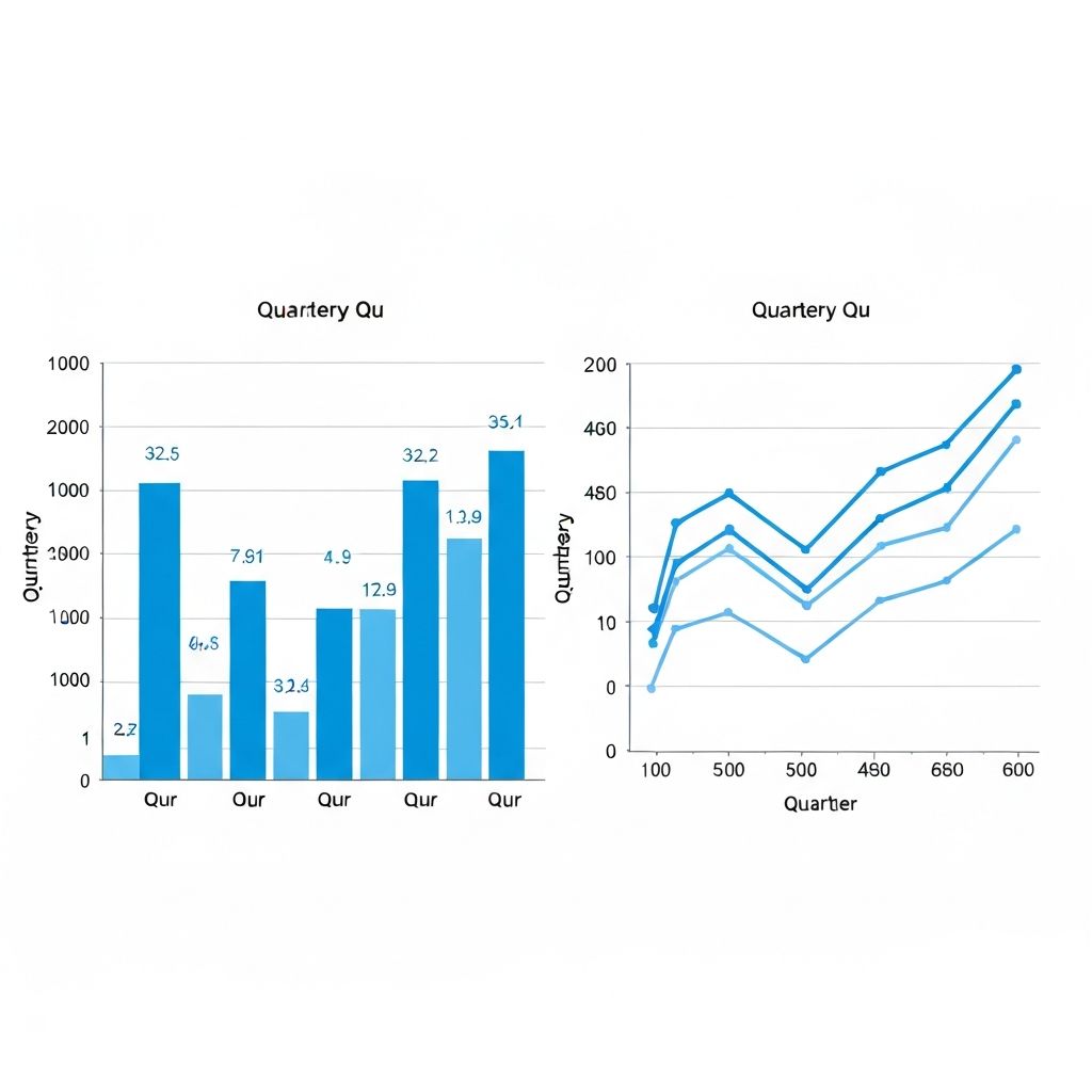
I got into an argument with a client last month about whether to use a bar chart or line chart for their quarterly revenue data.
They wanted a line chart because "it shows the trend." I pushed for bars because we had discrete quarterly data, not continuous measurements.
We were both partially right. And that's the problem with the standard advice.
The Textbook Answer (And Why It's Incomplete)
Every data viz guide says the same thing:
- Line charts = continuous data over time
- Bar charts = discrete categories
This is technically correct but practically useless.
Here's the real question: What are you trying to emphasize?
When Lines Win
1. You Want to Show a Trend
Line charts excel at revealing patterns. The connected points literally draw attention to the direction of change.
Monthly active users over 2 years? Line chart. Stock price over a trading day? Line chart. Temperature readings? Line chart.
2. You Have Many Data Points
If you're plotting 50+ observations, bars become a cluttered mess. Lines stay clean.
I once saw someone plot daily website visits for a year using a bar chart. 365 bars, each 1 pixel wide. It looked like a barcode. A line would have shown the seasonality beautifully.
3. You're Comparing Trajectories
When you need to compare how different series evolved over the same period, multiple lines are easier to track than grouped bars.
Exception: If the lines cross multiple times, consider small multiples instead.
When Bars Win
1. You Want to Compare Magnitudes
Bars have a natural baseline at zero. This makes absolute comparisons easier than with lines, where you're mentally measuring the gap between points and the axis.
Sales by region? Bar chart. Survey responses by category? Bar chart.
2. You Have Discrete Categories
Even if there's a time element, some data is naturally discrete.
Annual revenue by year works as bars because each year is a distinct period, not a continuous flow. Quarterly data is borderline—it depends on whether you're emphasizing the trend or the individual quarter performance.
3. Individual Values Matter More Than Pattern
If someone needs to quickly identify a specific value, bars with data labels are more precise than reading a point on a line.
The Gray Zone (Where Experience Matters)
Monthly Data: The Classic Debate
12 months is the awkward middle ground. I've seen convincing arguments for both.
My rule: If you're in a presentation and explaining month-over-month change, use bars. If you're showing a year-long trend, use a line.
Comparing Two Series
Two series with different scales? Neither chart handles this well.
Dual-axis charts are confusing. Two side-by-side charts are usually better. If you must combine them, use a bar-line combo where the bar is the primary metric and the line is secondary (like revenue bars with profit margin line).
What the Data Visualization Research Says
Studies by Cleveland and McGill (1984) found that we judge position along a common scale most accurately. Both bars and lines use this principle, which is why they're both effective.
The difference is in what happens after the initial perception:
- Bars encourage comparing individual values
- Lines encourage perceiving trends and patterns
Neither is "better"—they optimize for different cognitive tasks.
My Actual Decision Process
- Is exact value comparison important? → Bars
- Is the trend or pattern the story? → Lines
- More than 20 time points? → Lines
- Discrete categories (non-time)? → Bars
- Still uncertain? → Try both and show to a colleague
The Hybrid Approach
Sometimes the answer is both. A bar chart for the main view with a small line chart showing the same data as a "trend summary" works well in dashboards.
Or use bars for the current period with a line overlay showing the previous period for comparison.
Common Mistakes
Line Chart Mistakes
- Not starting at zero when it matters for interpretation
- Using lines for categorical data (connecting bars across categories)
- Too many overlapping lines (more than 4 is usually a mess)
Bar Chart Mistakes
- Not sorting when there's no natural order
- Using 3D effects (please stop)
- Making bars too wide or too narrow
- Inconsistent bar colors without meaning
Tools That Help
Modern tools like ChartGen.ai will often suggest the appropriate chart type based on your data structure. It's not magic—the algorithms look at whether your data is continuous or discrete, time-based or categorical.
But tools are starting points. The final decision still requires understanding what story you're telling.
The Real Answer
There's no universal rule. The "right" chart depends on:
- What you want to communicate
- How your audience will use the information
- The context of the presentation
When I'm genuinely uncertain, I create both versions and ask someone unfamiliar with the data which one answers the question faster.
That five-second test beats any theoretical framework.